Sometimes, there’s need to learn how previous transactions went. That said, every public company should have its financial transactions for a certain period documented. There’s also a need to know where to read earnings reports.
The earnings report is a formal financial document that shows how well a company performed financially over a specific time period. It is also known as a "profit and loss (P&L) statement.”
Investors can learn about a company's financial health by looking at its utiltiies earnings report. Hence, there is a need to properly understand how to interpret earnings reports.
Companies that are open to the public must submit quarterly reports to the SEC on either Form 10-K or Form 10-Q. The forms serve as a supplement to the company's published earnings report and contain all relevant data on the company's operations. One of these data sets for the company is the utilities earnings bridge chart, also known as the waterfall chart.
What is a Waterfall Chart?
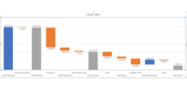
A waterfall chart shows the progression of anything from its initial value to its final value over a given time period. It’s a diagram that proves helpful when you wish to know how to interpret earnings reports.
For example, it may show how a bank account began, how it is currently, and how it progressively arrived at it. To do this, a sequence of numbers, such as payments made and received, must be added or subtracted.
Waterfall Chart 101
If you want to know how to understand earnings reports, a waterfall chart is one of the easiest ways to begin. Firstly, a consistent zero baseline is required for all of your bar charts. This is one of the few hard-and-fast laws of data presentation.
The first bar in a waterfall chart represents the starting point, and the last bar represents the ending point. These points can also be termed the "before" and "after" numbers.
Baselines of subtotal bars vary with the current sum shown. To rephrase, the end of one bar is the beginning of the following bar in a waterfall chart's middle section. This creates the optical illusion of an ascending and descending stairway joining two or more pillars.
For those who’ve never seen bars floating in space, understanding what a waterfall is about at first glance may be difficult. One complication is that the "baseline" of these component bars might be either the top or the bottom of the bar.
This depends on whether or not the number for that part is negative or positive. Negative bars are typically at the top of the bar, while the positive one falls below.
Waterfall charts can also include more than one time period. For a waterfall to show quarterly changes, it may need more than two "pillars.” The first shows the total for the first quarter, and the remaining ones show the changes for each subsequent quarter.
Bars broken down into their respective time periods' gains and losses will be seen between the two sets of verticals. Instead of a waterfall, we get a series of powerlines, zigzags, or arches, depending on how we put our parts together. This is the part where you must know where to read earnings reports to be able to understand what you’re seeing.
Furthermore, waterfalls may be seen more clearly in a handful of different ways. Some people find it helpful to use a different color for uptick bars than downtick bars. Others find it helpful to draw horizontal lines connecting the edges of bars.
This will give the eye something to follow as it moves from left to right across the chart. It will make the stair-step pattern easier to trace across components.
Uses of Waterfall Chart
It’s not enough to know how to understand earnings reports. There’s also a need to know when to use one.
Waterfall charts are helpful for displaying both negative and positive progress. It is the best way to get an overview of how things have changed. For an enterprise setting, consider the following examples:
A waterfall chart in human resources can display a variety of data, such as:
the beginning staff count
new hiring
internal transfers
employee departures
final staff count for the year
Secondly, the waterfall chart may be used to display the rise and fall of stock and share values over time. There are many charts that display this data in the field of accounting. However, a waterfall chart is a straightforward way to show a price series over time amongst all others.
Lastly, a waterfall chart is a useful tool for analyzing a company's financial performance. On this chart, you can see how much money was made from product sales and service revenues. You can also see how much was lost due to costs and the cost of products sold.
Finally, you can see how much was made in net profit. This can help you determine things like the top utilities stocks to buy now.
How to Read a Waterfall Chart
When you know how to understand a waterfall chart, you’ll know how to read company earnings reports. There are certain elements that come into play when you want to read a waterfall chart. With a clear understanding of these features, you can easily grasp what the chart is talking about. Below are the elements to observe to know how to read company earnings reports:
A Full Column at the Beginning and End
The sums on each end of the graph should be represented by full blocks. At the center is where we can find the floating-style Mario blocks.
Colors
Colors are essentially employed for clarity and readability. However, for waterfall charts, they represent different things.
In any case, the color should be chosen on purpose. This is to make sure that the intended meaning of the numbers doesn't get lost because of their random appearances.
The Horizontal Lines
Waterfall charts require some sort of relationship between the data points in order to make sense. This double duty is achieved by adding horizontal lines between the bars. It shows how the figures are connected and makes it easier to understand where the changes are happening.
The Labelling
Waterfall charts, like any other type of chart, should be straightforward and transparent. Headings and labels should be used to clarify information and prevent misunderstandings.
Changes in the Scale Number
A zero-based starting point is not required, as would be the case with most other types of charts. Don’t expect the scale to always begin at zero; this number is not constant and may change with the data given.
How to Create a Waterfall Chart in Excel
The best tool to use when creating a waterfall chart is Microsoft Excel. When using this software to make a waterfall chart, you visit the Charts tab, where you can simply select it as a template. Follow the process below to get everything set up:
Choose the table that holds your useful data or the values of your utility stock.
- Click onIClick on nsert.
- Select Waterfall from the Charts drop-down menu after clicking the Insert Waterfall Chart button.
Once you’ve completed the process above, you’re almost done with the chart. You’’ll notice that the notation for the before and after numbers doesn't show how much they add up to. Instead, they are shown as increases. Here’s how you can correct this mistake:
- To change the chart's starting point, just double-click the square containing the value. If you look to the right, you'll find the options to Format Data Point.
- Select Set as total from the Series Options menu.
- To see the final figure on the graph, simply double-click it.
- Make sure the sum in Set is correct.
Conclusion
Waterfall charts, when used properly, are an effective means of showing how data has changed over time. Whether to classify data or track progress over time, this graph makes it easy to see how a goal was achieved. They are, therefore, a common visual tool in the business world, particularly in the financial sector. Also, they make a perfect tool for learning how to read company earnings reports.
I/we have no positions in any asset mentioned, and no plans to initiate any positions for the next 7 days


Sometimes, there’s need to learn how previous transactions went. That said, every public company should have its financial transactions for a certain period documented. There’s also a need to know where to read earnings reports. The earnings report is a formal financial document that shows how well a company performed financially over a specific time period. It is also known as a "profit and loss (P&L) statement.”
Investors can learn about a company's financial health by looking at its utiltiies earnings report. Hence, there is a need to properly understand how to interpret earnings reports. Companies that are open to the public must submit quarterly reports to the SEC on either Form 10-K or Form 10-Q. The forms serve as a supplement to the company's published earnings report and contain all relevant data on the company's operations. One of these data sets for the company is the utilities earnings bridge chart, also known as the waterfall chart.
What is a Waterfall Chart?
A waterfall chart shows the progression of anything from its initial value to its final value over a given time period. It’s a diagram that proves helpful when you wish to know how to interpret earnings reports. For example, it may show how a bank account began, how it is currently, and how it progressively arrived at it. To do this, a sequence of numbers, such as payments made and received, must be added or subtracted.
Waterfall Chart 101
If you want to know how to understand earnings reports, a waterfall chart is one of the easiest ways to begin. Firstly, a consistent zero baseline is required for all of your bar charts. This is one of the few hard-and-fast laws of data presentation.
The first bar in a waterfall chart represents the starting point, and the last bar represents the ending point. These points can also be termed the "before" and "after" numbers.
Baselines of subtotal bars vary with the current sum shown. To rephrase, the end of one bar is the beginning of the following bar in a waterfall chart's middle section. This creates the optical illusion of an ascending and descending stairway joining two or more pillars.
For those who’ve never seen bars floating in space, understanding what a waterfall is about at first glance may be difficult. One complication is that the "baseline" of these component bars might be either the top or the bottom of the bar.
This depends on whether or not the number for that part is negative or positive. Negative bars are typically at the top of the bar, while the positive one falls below. Waterfall charts can also include more than one time period. For a waterfall to show quarterly changes, it may need more than two "pillars.” The first shows the total for the first quarter, and the remaining ones show the changes for each subsequent quarter.
Bars broken down into their respective time periods' gains and losses will be seen between the two sets of verticals. Instead of a waterfall, we get a series of powerlines, zigzags, or arches, depending on how we put our parts together. This is the part where you must know where to read earnings reports to be able to understand what you’re seeing.
Furthermore, waterfalls may be seen more clearly in a handful of different ways. Some people find it helpful to use a different color for uptick bars than downtick bars. Others find it helpful to draw horizontal lines connecting the edges of bars. This will give the eye something to follow as it moves from left to right across the chart. It will make the stair-step pattern easier to trace across components.
Uses of Waterfall Chart
It’s not enough to know how to understand earnings reports. There’s also a need to know when to use one. Waterfall charts are helpful for displaying both negative and positive progress. It is the best way to get an overview of how things have changed. For an enterprise setting, consider the following examples:
A waterfall chart in human resources can display a variety of data, such as: the beginning staff count new hiring internal transfers employee departures final staff count for the year
Secondly, the waterfall chart may be used to display the rise and fall of stock and share values over time. There are many charts that display this data in the field of accounting. However, a waterfall chart is a straightforward way to show a price series over time amongst all others.
Lastly, a waterfall chart is a useful tool for analyzing a company's financial performance. On this chart, you can see how much money was made from product sales and service revenues. You can also see how much was lost due to costs and the cost of products sold.
Finally, you can see how much was made in net profit. This can help you determine things like the top utilities stocks to buy now.
How to Read a Waterfall Chart
When you know how to understand a waterfall chart, you’ll know how to read company earnings reports. There are certain elements that come into play when you want to read a waterfall chart. With a clear understanding of these features, you can easily grasp what the chart is talking about. Below are the elements to observe to know how to read company earnings reports:
A Full Column at the Beginning and End
The sums on each end of the graph should be represented by full blocks. At the center is where we can find the floating-style Mario blocks.
Colors
Colors are essentially employed for clarity and readability. However, for waterfall charts, they represent different things. In any case, the color should be chosen on purpose. This is to make sure that the intended meaning of the numbers doesn't get lost because of their random appearances.
The Horizontal Lines
Waterfall charts require some sort of relationship between the data points in order to make sense. This double duty is achieved by adding horizontal lines between the bars. It shows how the figures are connected and makes it easier to understand where the changes are happening.
The Labelling
Waterfall charts, like any other type of chart, should be straightforward and transparent. Headings and labels should be used to clarify information and prevent misunderstandings.
Changes in the Scale Number
A zero-based starting point is not required, as would be the case with most other types of charts. Don’t expect the scale to always begin at zero; this number is not constant and may change with the data given.
How to Create a Waterfall Chart in Excel
The best tool to use when creating a waterfall chart is Microsoft Excel. When using this software to make a waterfall chart, you visit the Charts tab, where you can simply select it as a template. Follow the process below to get everything set up: Choose the table that holds your useful data or the values of your utility stock.
Once you’ve completed the process above, you’re almost done with the chart. You’’ll notice that the notation for the before and after numbers doesn't show how much they add up to. Instead, they are shown as increases. Here’s how you can correct this mistake:
Conclusion
Waterfall charts, when used properly, are an effective means of showing how data has changed over time. Whether to classify data or track progress over time, this graph makes it easy to see how a goal was achieved. They are, therefore, a common visual tool in the business world, particularly in the financial sector. Also, they make a perfect tool for learning how to read company earnings reports.
I/we have no positions in any asset mentioned, and no plans to initiate any positions for the next 7 days